561-532-2139


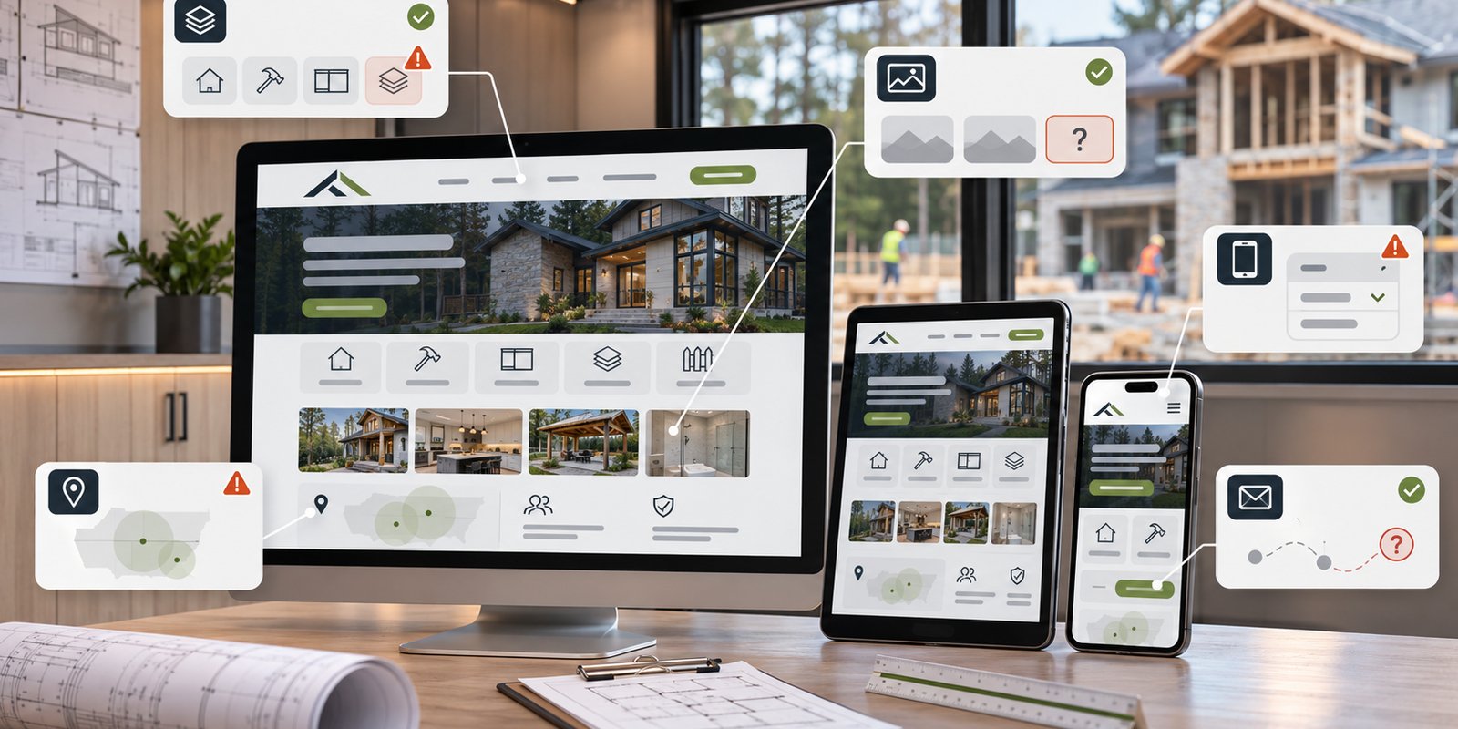

A contractor website does not need an obvious technical failure to make potential customers leave confused. Sometimes the site loads quickly, looks professional, and contains plenty of information, yet still makes it difficult to answer basic questions.
What does the contractor actually do? Does the company handle this type of project? Does it work in the right area? Can the visitor find relevant proof? What happens if they want to make contact?
When those answers are buried, vague, or inconsistent, the website creates unnecessary friction.
The most important contractor website mistakes are often not dramatic design problems. They are smaller communication and usability issues that make customers work harder than they should.
For contractors in West Palm Beach, reviewing the website from a first-time visitor's perspective can reveal where those obstacles exist and what information needs to become clearer.
1. Making Your Services Difficult to Understand
A contractor knows the difference between the services the business provides. A new visitor may not.
One common mistake is presenting every service as a short item in a long list without enough explanation to help someone determine which one applies to their project.
Another is using terminology that makes sense inside the trade but provides little context for the customer.
A useful service page should quickly establish what the service is and when someone might need it. Depending on the contractor, it may also explain the type of project involved, where the work is available, and what the next step is.
That does not mean every small service requires a separate page.
Major services with distinct customer needs may deserve individual pages. Closely related services can often be grouped when separating them would create several pages saying almost the same thing.
The homepage should work differently. Its job is to introduce the contractor, establish the main service categories, and help visitors move toward the information they need. Trying to explain every service in full on the homepage can make the page harder to scan.
Clear contractor service pages give each important topic enough space without forcing visitors to interpret a generic list.
2. Showing Project Photos Without Useful Context
Contractors often have something many other businesses do not: visible examples of completed work.
Project photography can be valuable, but uploading a large collection of images does not automatically make the website more informative.
A visitor may see a finished project and still have no idea what type of work was performed or which service it represents.
That is where context matters.
When accurate information is available, project photos can be placed near the relevant service or accompanied by a simple description of what the image shows. The explanation does not need to become a full case study.
In fact, adding unverified project details creates another problem.
The website should not invent costs, timelines, materials, customer circumstances, results, or technical specifications simply because an image needs a caption.
Stock photography also needs care. It can support a design, but it should not be presented in a way that suggests the contractor completed work shown in a generic image.
Real project content is most helpful when visitors can understand why it is relevant to the service they are considering.
The purpose of photography is not to fill space. It is to give potential customers useful visual context.
3. Making the Service Area Unclear or Overusing Locations
Local contractors need to tell potential customers where they work.
Some websites make that difficult by barely mentioning location. A visitor can read several pages and still be unsure whether the company serves West Palm Beach.
Other websites create the opposite problem by forcing city names into headings and paragraphs repeatedly or creating many near-identical location pages.
Neither approach improves clarity.
Geographic information should reflect the contractor's actual service area and appear where it helps the reader.
If West Palm Beach is a confirmed market, that can be communicated naturally within service content, company information, and contact pathways. Additional locations should appear only when the contractor actually serves them.
A separate location page should also have a useful purpose beyond replacing one city name with another.
Repeating the same service description across multiple geographic pages creates a poor experience and can make the website feel written for search engines rather than customers.
Consistency matters too.
The homepage, service pages, contact information, and other geographic references should not imply different service areas.
Good local relevance is straightforward: tell customers where the service is available without turning the website into a collection of repetitive location phrases.
4. Treating Mobile Usability as a Final Adjustment
Potential customers may first encounter a contractor from a phone after a referral, search result, social post, or local listing.
A website can technically be responsive and still be difficult to use on mobile.
Common problems include crowded menus, long text blocks, oversized project images, difficult forms, small buttons, and contact information that takes too much effort to find.
A mobile contractor website should prioritize the same questions customers need answered on a larger screen, but the experience must work comfortably within less space.
Visitors should be able to identify the main services, reach the relevant page, understand the content, and find a contact option without constant zooming or unnecessary navigation.
Project images also need to be handled carefully. Large photographs can be useful, but they should not dominate the experience or make important information difficult to reach.
Wellington Web Designs discusses these issues further in its guide to mobile-friendly web design for West Palm Beach businesses.
Mobile usability works best when it is part of the website structure from the beginning rather than treated as a smaller copy of the desktop site.
5. Replacing Real Trust Information With Generic Claims
Contractor websites commonly use phrases such as quality workmanship, dependable service, trusted professionals, or excellent results.
The problem is not that those statements sound positive. It is that almost any contractor could use them.
Potential customers have more to work with when the website provides specific, verified information.
Depending on what the business has approved, that might include real project photography, accurate company information, current service details, genuine reviews, confirmed credentials, or clear information about where the contractor works.
The website should never create trust by inventing facts.
Awards, certifications, licenses, partnerships, warranties, guarantees, financing programs, years of experience, emergency availability, or performance claims should appear only when they have been verified.
Consistency is another trust signal that is easy to overlook.
A phone number should not change from page to page. Services that are no longer offered should not remain in navigation. Different sections should not provide conflicting geographic information.
Small inconsistencies can make an otherwise polished website feel neglected.
Credibility comes from making the real business easier to understand, not from adding claims simply because they sound persuasive.
6. Asking for Contact Before the Visitor Has Enough Information
Calls to action are important, but adding more of them does not necessarily make a contractor website easier to use.
A potential customer may arrive on a service page with basic questions still unanswered. Asking that person to request a consultation immediately, and then repeating the same request several more times, does not solve the information gap.
The contact path should follow the content.
Explain the service first. Make geographic fit understandable. Provide relevant trust information where it is available. Then give the visitor an appropriate way to continue.
Wellington Web Designs explains this approach further in its guide to turning website visitors into inquiries.
Forms should also match the stage of the conversation.
An initial inquiry should gather information the business actually needs without creating unnecessary work for someone who is simply trying to start a conversation.
CTA wording must remain accurate as well.
A contractor website should not promise free estimates, immediate appointments, guaranteed response times, inspections, or other offers unless the company has confirmed them.
A useful conversion path removes uncertainty. It does not replace clear information with repeated requests to contact the business.
Fix the Friction Customers Actually Notice
Contractor website problems are not always obvious during a quick internal review because the business already understands its own services.
A first-time visitor does not have that background.
Review the site as if you know nothing about the contractor.
Can you identify the main services within a few moments? Can you tell whether the company handles the type of project you have in mind? Is the service area clear? Do project images tell you anything useful? Does the mobile experience remain practical? Are credibility claims supported by real information? Does the next step make sense after you have read the page?
If those answers are difficult to find, the website may be creating friction that has nothing to do with the contractor's actual ability to perform the work.
Correcting those issues does not require adding every possible website feature.
Often, the better approach is to simplify the path, clarify the content, remove unsupported claims, and make important information easier to find.
Wellington Web Designs works with businesses that need websites structured around clearer services, usability, and customer action. For contractors in West Palm Beach reviewing an existing site, the first priority should be identifying where the website makes customers work harder than necessary.
Request a Free Consultation to discuss which parts of your current contractor website may need a clearer approach.
FAQ
What are the most common contractor website mistakes?
Common problems include unclear service descriptions, project photos without context, vague or inaccurate service areas, poor mobile usability, unsupported trust claims, and contact paths that ask visitors to act before they have enough information.
Should every contractor service have its own website page?
No. Major services with distinct customer needs may benefit from dedicated pages, while closely related services can often be grouped together. The goal is to help visitors understand the business without creating repetitive pages.
Why does mobile usability matter for a contractor website?
Potential customers may visit from a phone after a search, referral, social post, or local listing. Clear navigation, readable content, practical forms, and accessible contact options help them evaluate the business without unnecessary friction.
How can a West Palm Beach contractor tell if its website needs improvement?
Check whether a first-time visitor can quickly understand the services, confirm the service area, find credible business information, use the site comfortably on mobile, and identify a logical next step. Difficulty in those areas can signal that the website needs attention.